We all know what logos are, but have you ever considered how they come to be? Believe it or not, they don’t just materialize out of thin air like water droplets in a thunderhead.
Logo design is a lot of hard work (more than simply picking a new font). There’s a very refined process that many designers use to create logos. There’s some minor variation, of course, but by and large, it’s a fairly consistent set of steps. In order to help get my point across, I’m going to both show and tell by creating a brand new logo, fresh out of the oven.
1. Ask questions—If you’re working with a client, it’s crucial that you know as much as possible about the brand and the project. Who, what, where, when, why, and how are all great starting points. Gather information about the message to be communicated, the audience (receiver of the message), and the brand or organization (sender of the message). All these answers will directly inform the logo itself, from its content to its visual style.
Since I’m not working with a client here, I’ll just make something up. How about a meat-crazy steakhouse that’s a little more down-to-earth and lighthearted than the usual fancy steakhouse? Let’s call it “The Carnivore.”
2. Conceptualize—This means sketch, sketch, and sketch some more to explore every potential idea, even the bad ones. In fact, I often find that I can’t produce good ideas until I’ve come up with a few bad ones first. Free association list making is another helpful tool to drum up some creativity.
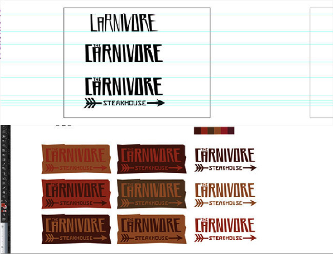
For The Carnivore, I thought it would be fun and interesting to adopt a very masculine, almost cave-man-like aesthetic—hence the crude arrow and lack of established fonts.
3. Produce—Once you have come up with a good idea, the next step is production. Using vector software (usually Adobe Illustrator), create the logo.
A few tips:
● Always begin in black and white to focus on the form—color shouldn’t be added until near the end of the process.
● Generally, simplicity is the best way to go. It usually allows the concept to shine through more quickly, and it improves readability at a glance and at small sizes.
● Be sure all of your bezier curves and vector points are smooth and decisive and your typography is properly kerned. Beauty is in the details after all.
My first round of letterforms didn’t feel right. After some adjustments and proper spacing of elements, I explored different color options.
4. Evaluate—Once you get the logo to a somewhat finished point, step back and take a look. Be certain that it fits with the information you gained in step one. Make any necessary clean-ups or adjustments to ensure that the logo is as great as it can be. Also, don’t forget to ask for a critique from both designers and non-designers alike. Any feedback is good feedback, and will help you become a stronger designer in the future.
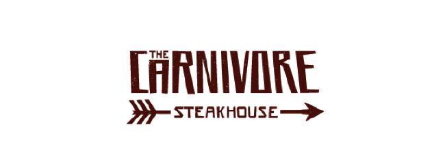
After adding color and some texture it’s ready for presentation.
So the next time you spot a logo out in the world, try and imagine the four steps that went into its creation. Ask yourself these questions: What message is it communicating? Does it make sense? Is it as great as it can be?
Could you come up with something better?


